Hamburger Menu Animation

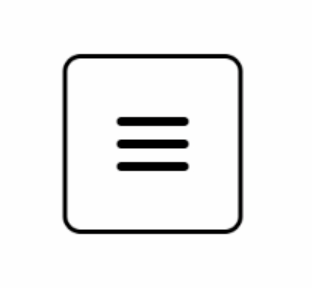
Let's take a look at how to create a hamburger menu toggle that transitions to a cross icon on hover. We have this simple icon:
<div class="grid justify-items-center gap-1.5"> <span class="h-1 w-8 rounded-full bg-black">/<span> <span class="h-1 w-8 rounded-full bg-black">/<span> <span class="h-1 w-8 rounded-full bg-black">/<span></div>
To create the cross icon, we want the middle line to disappear and rotate the top and bottom lines by 45 degrees.
First, we'll add a class of rotate-45 to the first span. However, we don't want the rotation to happen all the time, only when we hover over the button. If we add the hover modifier directly to the class, it won't work as expected. Instead, we need to mark the whole button as a group and trigger the rotation on group hover.
We also need to add a transition utility class to make the rotation smoother. Copy the transition and group-hover:rotate-45 classes and paste them to the last span element, but change the rotation to -rotate-45.
<button class="group h-20 w-20 rounded-lg border-2 border-black"> <div class="grid justify-items-center gap-1.5"> <span class="h-1 w-8 rounded-full bg-black group-hover:rotate-45">/<span> <span class="h-1 w-8 rounded-full bg-black">/<span> <span class="h-1 w-8 rounded-full bg-black group-hover:-rotate-45">/<span> </div></button>
Our current design looks more like an arrow than a cross. We want our sticks to cross in the middle, so we'll need to translate them vertically. We'll do this by modifying the first <span> with group-hover:translate-y-2.5 and the last one with -translate-y-2.5.
Next, we want our middle stick to disappear, but instead of hiding it, we can make it scale horizontally to zero. This will create a nice squashing effect. To achieve this, we'll add group-hover:scale-x-0 transition.
<button class="group h-20 w-20 rounded-lg border-2 border-black"> <div class="grid justify-items-center gap-1.5"> <span class="h-1 w-8 rounded-full bg-black transition group-hover:rotate-45 group-hover:translate-y-2.5">/<span> <span class="h-1 w-8 rounded-full bg-black group-hover:scale-x-0 transition">/<span> <span class="h-1 w-8 rounded-full bg-black group-hover:-rotate-45 group-hover:-translate-y-2.5">/<span> </div></button>
Now let's slow down the transition duration-[3s] on all three sticks and take a look at the result. The two bars dip up and down, and the middle bar slowly reappears. It's not perfect, but when sped up, it looks decent!

We could stop here, but let's have some fun and make our three sticks look like a hamburger!
Hamburger and Fries Design
First, we'll start with the hamburger. The top and bottom sticks will represent the bread buns. We'll give them both a background color of bg-orange-400. To make the buns thicker, we'll set the height to h-2.
For the top one, instead of rounded-full, we only want the top corners to be rounded and then a nice flat cut at the bottom rounded-t-full. And for the bottom one here, we'll go rounded-b-full.
Next, let's take care of the meat patty in the middle. We'll make it a little bit thicker with a height of h-1.5 and change the color to bg-orange-800.
Lastly, we'll adjust the gap between the bread and the meat, as it's a bit too big. Instead of a gap-1.5, we'll use a gap-[3px].
With these changes, our hamburger design is complete!

The final code looks like this:
<button class="group h-20 w-20 rounded-lg border-2 border-black"> <div class="grid justify-items-center gap-1.5"> // Top Bun <span class="h-1 w-8 rounded-full bg-black transition group-hover:rotate-45 group-hover:translate-y-2.5">/<span> // Meat Patty <span class="h-1 w-8 rounded-full bg-black group-hover:scale-x-0 transition">/<span> //Bottom Bun <span class="h-1 w-8 rounded-full bg-black group-hover:-rotate-45 group-hover:-translate-y-2.5">/<span> </div></button>
And there you have it - a simple hamburger and fries design using Tailwind CSS!
Transcript
00:00 Let's take this hamburger menu toggle and make it transition to a cross icon on hover. Before we start, let's take a look at how these three lines are created. So these are just three span elements with a height of 1 and a width of 8. And they're stacked on top of each other in a grid. So if I was to hide the last two,
00:16 you see that each one is just a little horizontal stick like that. Okay, and if you think of a cross, it's made of two sticks. So what we want to do is have the middle stick here disappear and then rotate the top and bottom sticks by 45 degrees so that they go from a line to a cross. So let's try that.
00:34 The first span, I will add a class of Rotate 45. But I don't want this to happen all the time. I want this to only happen when I hover over the button. And if I add the hover modifier here directly on the class, this is not going to do exactly what we want. So if I hover the button, nothing happens.
00:52 And only when I hover the stick itself is the rotation happening. So we want to mark the whole button as a group. And then on group hover is when we want to trigger the rotation. So on the button element here, I will add group. And then instead of hover rotate 45 degrees,
01:10 I will have group hover rotate 45. And now when I hover the button, the rotation happens. Okay, nice. And let's also add a transition utility class. Nice. So I'll copy the transition and group hover rotate 45 classes. And I will paste these to the last element as well.
01:29 But we want to change the rotation to minus rotate 45 degrees. And let's take a look at what we have. All right, interesting. It's looking more like an arrow than a cross for now, but we'll work on that. We also want to translate our sticks vertically so that they cross in the middle.
01:45 So for the first stick, once again, group hover translate y2. And I'll copy that and set the bottom stick to minus translate y2. So it goes up. And let's see if it works. All right. And it looks like it's just not enough. We want the top bar to go down a little bit more
02:04 and the bottom bar to go up a little bit more. So let's try to change both from 2 to 2.5. Yeah, very nice. We can start to see it take shape. All right. And so now we want our middle stick here to basically disappear. But instead of just hiding it, maybe we can make it scale horizontally to zero.
02:23 So it sort of squashes on itself and disappears in a nice little disappearance. Group hover scale x zero. Oops. And I forgot to also add the transition. And check the results. That's pretty nice. Let me slow the transition right down on all three sticks. So hover.
02:47 And you can see the two bars dipping up and down. And as I release, they'll go back up. And you can see the middle bar slowly reappearing in the middle. So it's not perfect. But when it's sped up enough, it's looking really decent. We could stop right there. We've done the implementation. But since it's called a hamburger menu, let's have some fun with it.
03:05 We'll make our three boring sticks here look like, well, a hamburger. The top and bottom sticks can be the bread buns. So I'll give them both a background color of PG Orange 400. We'll make those buns thicker with H2. And for the top one, instead of rounded full,
03:22 we only want the top corners to be rounded and then a nice flat cut at the bottom. So rounded dash T dash full. And for the bottom one here, we'll go rounded dash B dash full. Next, let's take care of the meat patty in the middle. So I'll go a little bit thicker with 1.5 in height.
03:38 And we'll change the color to PG Orange 800. And the last thing I want to do, because the gap between the bread and the meat is a bit too big, is change this gap 1.5 and halve it. So instead of 6, I want 3 pixels. So now we have hamburger and fries.
- Play Congratulations on Completing the Workshop!
Congratulations on Completing the Workshop!
- Play App Varieties - Wrap Up
App Varieties - Wrap Up
- Play Simple Apps Without package.json - Solution
Simple Apps Without package.json - Solution
- Play Simple Apps Without package.json - Problem
Simple Apps Without package.json - Problem
- Play Apps Without Preview - Solution
Apps Without Preview - Solution
- Play Apps Without Preview - Problem
Apps Without Preview - Problem


