Exploring the has Utility in Tailwind CSS

Tailwind CSS's has utility brings a new layer of flexibility to styling based on conditions.
We have four cards, some have a title, some don't, and some have an image.
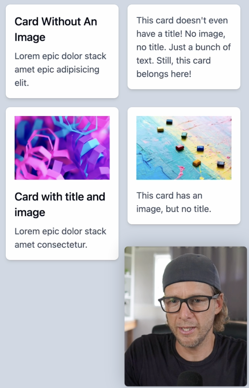
Data for the cards is structured as an array of objects with properties like title, text, and optionally, image. The interface is an unordered list in a two-column grid, dynamically rendering cards for each data item.
const cardsData = [ { title: 'Card Without An Image', text: 'Lorem epic dolor stack amet epic adipisicing elit.', }, { text: "This card doesn't even have a title! No image, no title. Just a bunch of text. Still, this card belongs here!", }, { title: 'Card with title and image', text: 'Lorem epic dolor stack amet consectetur.', image: `https://images.unsplash.com/photo-1530714457710-6bf1899c1d32?w=800&auto=format&fit=crop&q=60&ixlib=rb-4.0.3&ixid=M3wxMjA3fDB8MHxzZWFyY2h8MjZ8fHZpYnJhbnQlMjBjb2xvcnN8ZW58MHwwfDB8fHww`, }, { text: 'This card has an image, but no title.', image: `https://images.unsplash.com/photo-1528811692195-d5037ac4b7cc?w=800&auto=format&fit=crop&q=60&ixlib=rb-4.0.3&ixid=M3wxMjA3fDB8MHxzZWFyY2h8MTA2fHx2aWJyYW50JTIwY29sb3JzfGVufDB8MHwwfHx8MA%3D%3D`, },]export default function Has() { return ( <div className="min-h-screen bg-slate-300"> <ul className="mx-auto grid max-w-5xl grid-cols-2 items-start gap-4 p-6"> {cardsData.map((card, i) => ( <Card key={i} {...card} /> ))} </ul> </div> )}
The Card component takes optional image and title props alongside a mandatory text prop.
type CardProps = { image?: string title?: string text: string}function Card({ image, title, text }: CardProps) { return ( <li className="overflow-hidden rounded-lg bg-white p-4 shadow-md ring-1 ring-black/5 transition hover:-translate-y-px hover:shadow-lg"> {image && <img src={image} alt="" className="mb-4" />} <div className="grid gap-2"> {title && <h2 className="text-xl font-medium">{title}</h2>} <p className="text-slate-700">{text}</p> </div> </li> )}
The has pseudo-class allows you to style an element based on the condition that you pass as a parameter. For example, we can change the background color of a card if the card has a title by adding has-[] to our li element and setting a condition has-[h2]:bg-yellow-200
<li className="overflow-hidden rounded-lg bg-white p-4 shadow-md ring-1 ring-black/5 transition hover:-translate-y-px hover:shadow-lg has-[h2]:bg-yellow-200">
Now, only the cards with an h2 tag have that yellow background color. We can do the same for cards that have an image by changing our condition from has-[h2] to has-[img] Now, the two cards with the image have the background color.
But what about cards that have both an image and a title? There's only one card with both in our example.
We can try using the sibling selector has-[img+h2]
However, this doesn't work. The syntax img+h2 expects an h2 tag to be an immediate sibling of the image, which isn't the case in our example. We have an image, and its immediate sibling is a div. Inside that div, there's an h2 element.
To express the correct relationship between these elements, we can use the following selector has-[img+div_h2]
By constructing the correct condition, we can see that this is a powerful technique, even though we're just scratching the surface.
Now, let's make our example more useful and realistic. We'll remove the has-[img+div_h2]:bg-yellow-200.
Our goal is when a card has an image, make the image full-bleed inside the card container. To do that, we need to remove the internal padding that the card has, which is applied with p-4.
To remove the padding when there's an image, we can try adding has-[img]:p-0. This works nicely, and the image now goes edge to edge
However, since the padding was removed, we need to fix the padding on the text section. One solution is adding padding to the container containing the title and text.
<div className="grid gap-2 p-4">
This works just fine for the cards with an image, but we now have double padding,for those who don't have an image.
To fix this, we can do something similar to what we did earlier. If there's an image, we want to add the padding. This is only a problem when we have an image
You might be tempted to use has-[img]:p-4 to add padding to an element containing an image. However, this won't work as expected. The has-[img] class is looking for an <img> tag inside the current element, but our <div> doesn't have an image inside. The image is outside of it.
We can create a group and use the group-has utility to solve this issue. Add the group class on the <li> element, and now the padding is applied correctly in all scenarios, whether there's an image or not.
<li className="group overflow-hidden rounded-lg bg-white p-4 shadow-md ring-1 ring-black/5 transition hover:-translate-y-px hover:shadow-lg has-[h2]:bg-yellow-200">........<div className="grid gap-2 group-has-[img]:p-4">
The group-has utility intelligently scopes the has condition to the group, which is the <li> element in this case.
Now that we've changed the way our card is built, let's remove the className="mb-4" on the image, because of the way we're handling spacing now we never have to worry about spacing from the image because If the image is there It will create the padding around the text container.
Handling Name Scoped Groups
Sometimes, you have name-scoped groups, like group/card, which is useful when you have multiple nested groups and need to differentiate them. This will break our card because it now relies on the group/card.
<li className="group/card overflow-hidden rounded-lg bg-white p-4 shadow-md ring-1 ring-black/5 transition hover:-translate-y-px hover:shadow-lg has-[h2]:bg-yellow-200">
To fix this, make sure the group-has condition also respects this namespace:
<div className="grid gap-2 group-has-[img]/card:p-4">
Now everything works as expected.
Arbitrary variants
Out of the box, the has utilities are already quite flexible. If you need more complex functionality, you can always use arbitrary variants to customize your design further. Let's say you want to change the background color of cards that do not have a title. You can use an arbitrary expression to achieve this. Combine the :has utility with the :not pseudo-class like so:
[&:not(:has(h2))]:bg-yellow-200
This will change the background color of cards without an <h2> element.
Hopefully, this has given you some ideas, and your brain is now buzzing with things you could do using the has utility in Tailwind CSS.
Transcript
00:00 Let's take a look at how the new has utilities work in Tailwind. So I have four cards here, and you can see some have a title, some don't, some have an image. The data for the cards is here. So it's an array of objects, title, text, and sometimes image. And then we have an unordered list that is set as a two-column grid.
00:17 And inside of there, we're outputting a card for each card in our cards data array. If I scroll down, we'll find the card components. So you can see the props, an optional image and title, and then a mandatory text. And here's the markup for the card. So the has pseudo class lets you style an element based on the condition that you pass as a parameter.
00:36 For example, I could change the background color of the card if the card has a title. So here in the li element, has dash and then square brackets. And here I'll pass my condition. So if the card has an h2, then I want to set the background color to yellow 200.
00:55 And now only the cards with an h2 tag have that yellow background color. I could do the same for cards that have an image. So has image. And now the two cards with the image have the background. What about cards that have an image and a title? So there's only one here. Maybe I could try the sibling selector. So has image plus h2.
01:15 But that's not working. So that syntax, image plus h2, expects an h2 tag to be an immediate sibling of the image. But if we look here, we have our image and the immediate sibling is this div here. And then the h2 is inside.
01:30 So the correct way to express that would be image and then the sibling div space with an underscore h2. And I believe that will work because it has now constructed the correct has condition. So you can see this is pretty powerful and we're barely scratching the surface. But now instead of just changing the background color, let's do something a little bit more
01:50 useful and realistic. So I'll get rid of this has image and div. And so what we're going to do is when we have an image, we want the image to be full bleed inside the card container. So we want to remove this internal padding that the card has. You can see it apply here with p-4.
02:07 So when there's an image, we want to remove that. So let's try has image padding zero. And yeah, nice. You can see now the image is going edge to edge. But there's obviously a problem with the padding here. The cards without an image have not have their padding removed. So this is working like we want.
02:26 But now we need to fix the mess we've done down here. So what about taking the container that has the title and text, this div here, and adding some padding here? And yep, now it's working. But we now have double padding here because we have the p-4 on the li item and then the p-4 on our div.
02:46 What we want to do here is do something similar we've done here. If we have an image, we want to add the padding because this is only a problem when we have an image. So you may think, yeah, let's do has image p-4. But that is not going to work, as you can see.
03:02 The reason is this has image class is looking for an image tag inside that current element. But that element here, that div, doesn't have an image inside. The image is here outside of it. And so something we can do here is create a group and then use the group has utility.
03:20 So on the li element, I will add the toggle class of group. And then I will turn this has into using group-has. And now you can see that the padding is applied correctly on all scenarios, image or no image. That group has has intelligently scoped the has condition to the group, which is the li right there.
03:40 And so that's why it's working. Now that we've slightly changed the way our card is built, I'm going to remove the margin bottom on the image. You can see here we have this class mb4. But the way we're handling the spacing now, we never need to worry about spacing from the image, because if the image is there, it will create the padding around the text
04:00 container here. And while we're talking about groups, you know how sometimes you have name scoped groups, something like group slash card, which is useful when you have multiple nested groups, you need to differentiate. This is going to break our card because now we're relying on this group card.
04:16 All you have to do is make sure that the group-has condition also respects this namespace. And now it works again. Out of the box, the has utilities are already super flexible. And if you want to go even more complex, you can always drop down to arbitrary variant here.
04:33 Say, for example, you wanted to change the background color to cards that do not have a title. You could drop to the middle here and have an arbitrary expression and say, if the current element does not has, does not has an h2, let's change the bg to yellow 200.
04:53 And now we're composing has with not. And you can see that the generated CSS is pretty advanced, but it is what you would handwrite if you were writing it by hand. So use this with moderation. But hopefully this video gave you some ideas and your brain is starting to think about things you could do with the has utilities.
- Play Congratulations on Completing the Workshop!
Congratulations on Completing the Workshop!
- Play App Varieties - Wrap Up
App Varieties - Wrap Up
- Play Simple Apps Without package.json - Solution
Simple Apps Without package.json - Solution
- Play Simple Apps Without package.json - Problem
Simple Apps Without package.json - Problem
- Play Apps Without Preview - Solution
Apps Without Preview - Solution
- Play Apps Without Preview - Problem
Apps Without Preview - Problem


