Mix Blend Modes

In a previous tutorial, we created a cool text effect using background-clip:
Now, we're going to expand on our previous work to give us more control over the effect using mix blend modes.
Setting the Stage
To start with, we'll strip down the code from the previous tip leaving only the basic structure:
export default function ImageText() { return ( <div className="font-paytone-one grid h-screen place-items-center"></div> );}
The first thing we'll add is a large black rectangle to act as a frame Create a new div with a class of bg-black. For the width, we'll use w-2/3 to take up two-thirds of the available space. Instead of setting a fixed height, we're going to use the built-in aspect-video class to give the rectangle a ratio of 16:9 like a video would have. This creates a nice, large box for us to work with.
<div className="font-paytone-one grid h-screen place-items-center"> <div className="aspect-video w-2/3 bg-black"></div></div>
Now our frame is in place:

Our goal is to fill the frame with our background image. Then the text will sit in the center, and the image will be visible both through the text as well as the rest of the frame.
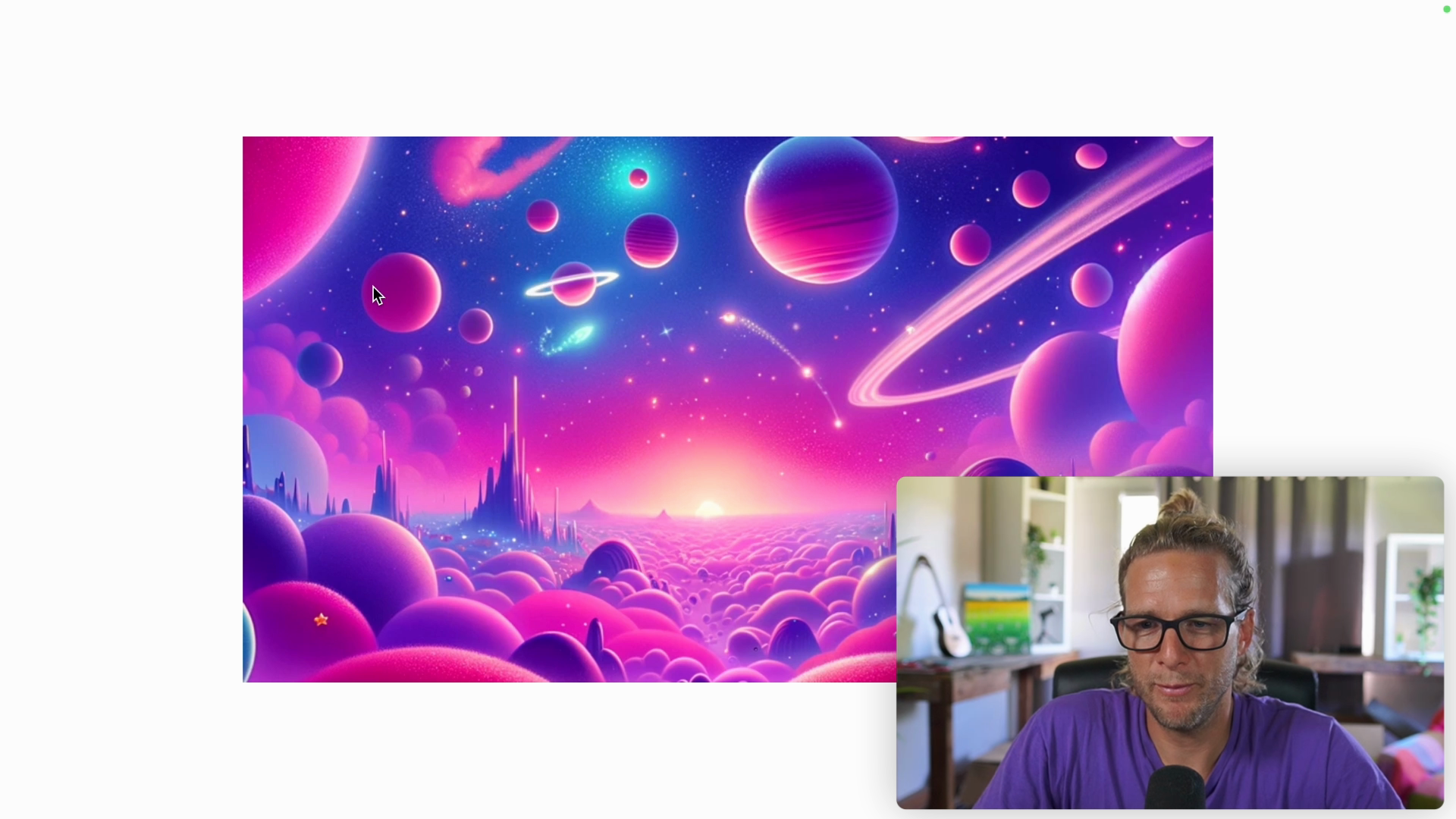
In order to be able to absolutely position things inside of the frame, we will give it the class of relative. Then inside of the frame div, we'll add an img tag that points to our space scene. To position the image exactly where we want it, we set it to an absolute position. To avoid stretching the image, we'll add the object-cover property.
We can remove the bg-black class from the frame div now that we have our background image in place:
<div className="font-paytone-one grid h-screen place-items-center"> <div className="relative aspect-video w-2/3"> <img src="/img/space-scene.png" className="absolute inset-0 w-full h-full object-cover" /> </div></div>
Here's how it looks:
Adding the Text
With our background image in place, we can bring back our heading tag and position it in the center of the box.
Note that we can't see the text because it's behind the absolutely positioned image. We can fix this by giving the frame div a relative position:
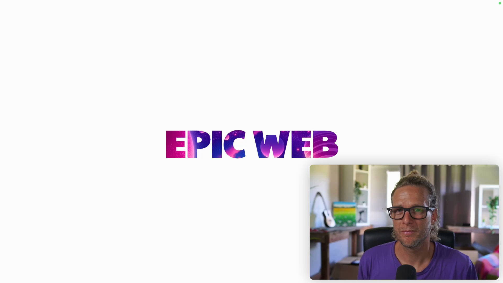
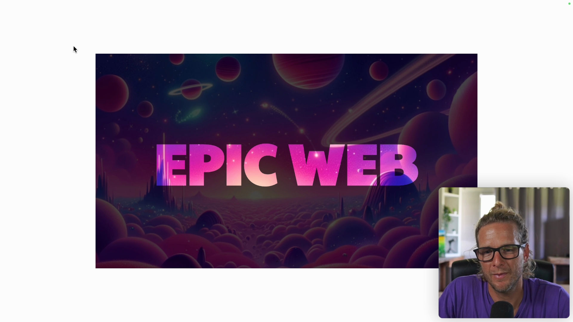
<div className="font-paytone-one grid h-screen place-items-center"> <div className="relative aspect-video w-2/3"> <img src="/img/space-scene.png" className="absolute inset-0 w-full h-full object-cover" /> <h1 className="isolate text-8xl font-black uppercase">Epic Web</h1> </div></div>
For the h1, instead of using relative for positioning, we will use the isolate property. This will create a new stacking context in a more direct way than using relative.
Here's how it looks with our heading added:

In order to center the text, we'll add a div that wraps the h1. The div will use CSS Grid to take up all the available height and center the text vertically and horizontally. We'll use the place-items-center class to center the text, and move the isolate class from the h1 into this new wrapper div:
// below the img tag<div className="isolate grid h-full place-items-center"> <h1 className="text-8xl font-black uppercase">Epic Web</h1></div>

Adding the Clipping Effect
Now that everything is set, we are ready to create the see-through clipping effect using mix blend modes.
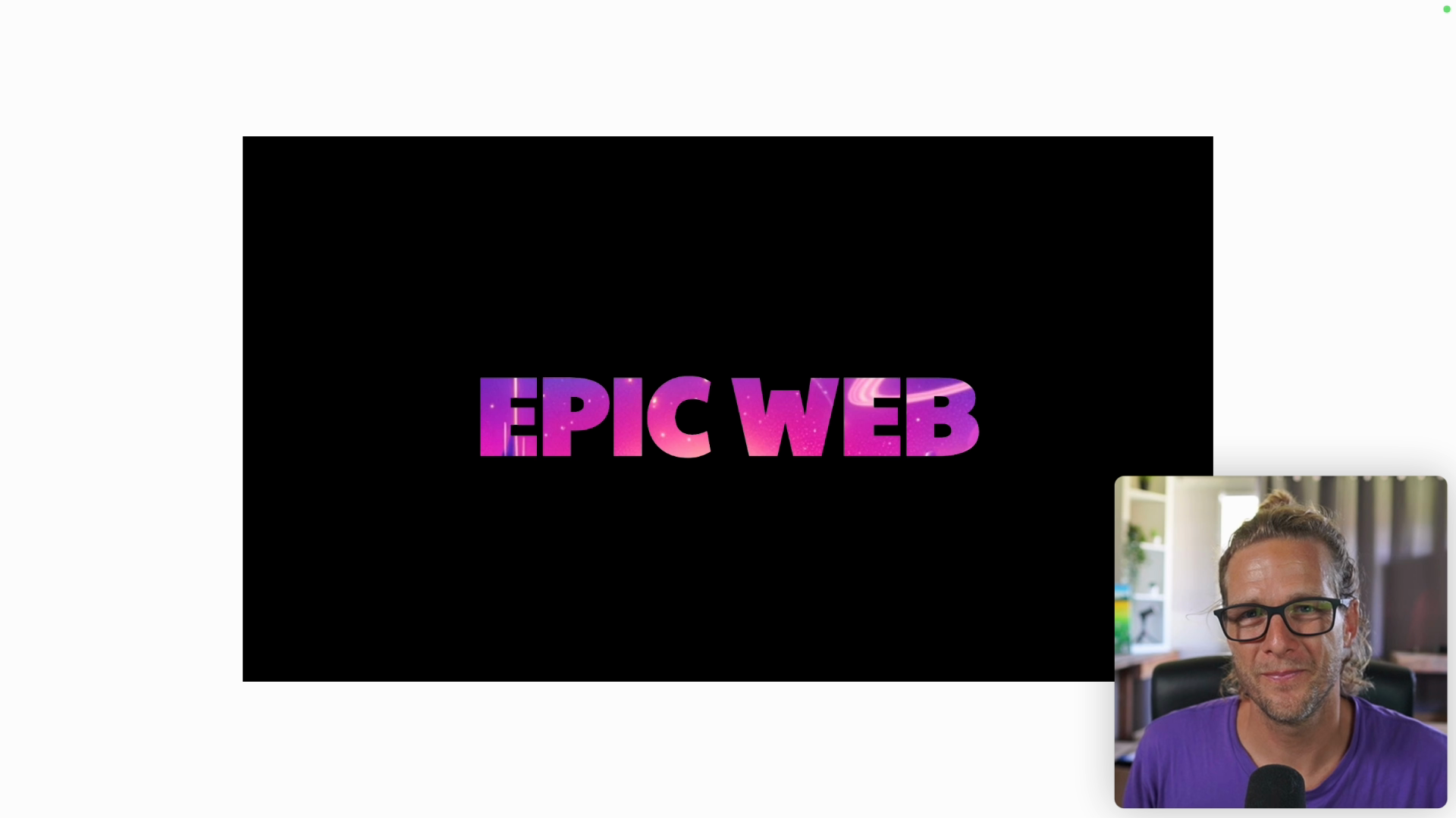
First, we will color the entire div that wraps the heading with a black background and color the heading text white:
// below the img tag<div className="isolate grid h-full place-items-center bg-black"> <h1 className="text-8xl font-black uppercase text-white">Epic Web</h1></div>
Here's how it looks:

The magic comes from using the mix-blend-darken class on the wrapping div:
// below the img tag<div className="isolate grid h-full place-items-center bg-black mix-blend-darken"> <h1 className="text-8xl font-black uppercase text-white">Epic Web</h1></div>
In this case, darken says that when two things are layered on top of each other, the darker pixel wins.
Since we have a black background, it will stay in place. However, since text is white, it will allow image to show through:
Exploring the Possibilities
There are many mix-blend- classes available that give us far more flexibility than that the background-clip method. For example, any shape or SVG icon could be used to show the image. There are also other modes that allow for other effects like blurring.
However, you might be wondering why not use the background-clip text method from the previous tutorial. The main advantage of using mix blend modes is the flexibility it offers.
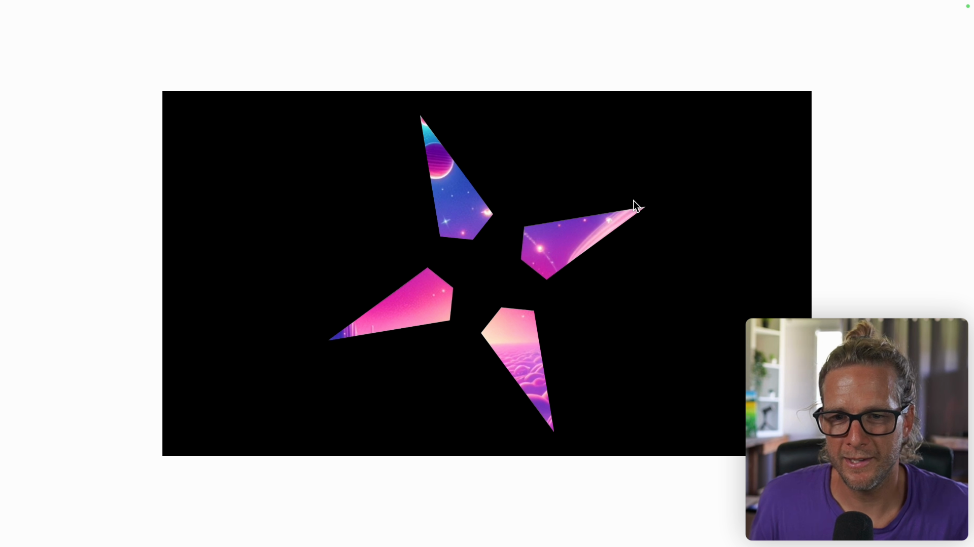
Let's experiment with a shape that we can draw using a div.
Comment out the h1 and create a div with a height and width of 56 pixels, rounded to xl, and rotated 45 degrees with a white background:
<div className="isolate grid h-full place-items-center bg-black mix-blend-darken"> <div className="h-56 w-56 rounded-xl rotate-45 bg-white"></div></div>

This technique also supports animation. We can add the transition class along with hover:translate-x-40 which will move the div over by 40 pixels and hover:rotate-0 which will remove the rotation on hover:

We could also paste in an SVG icon and add the animate-spin class along with [animation-duration:60s] to make it spin for a minute:
If we switch mix-blend-darken to mix-blend-lighten, the lighter pixels will always win. Here's how it looks in this opposite mode:

You can also use other colors besides pure black and white.
Going back to our text example, we can update the bg-black class to bg-yellow-600 to give the image a chance to show through:

Changing the background back to black but at 70% opacity gives us a different effect:

We've only scratched the surface of the effects that you can create with the help of mix-blend modes.
Adding Animation
Now, let's revisit the slowpan animation we created in the previous tutorial. This time, we'll be adding the animation onto the image instead of the text.
Since the image is using 100% of the frame, when we move it, it will show its edges and look a bit odd.
To avoid this, we need to increase the size of the image so that it's larger than the frame. This will give us room to animate the image without showing the edges.
Because the Tailwind CSS reset sets the max width to 100%, we will need to remove it in order to give the image sizes larger than 100%.
In the image tag, we'll set the height and width each to 120%:
<img src="/img/space-scene.png" className="animate-slowpan absolute inset-0 h-[120%] w-[120%] object-cover>

In order for the animation to look good, we'll need to make some adjustments to the presets file at tailwind-presets/image-text.ts:
// inside of tailwind-presets/image-text.ts...keyfames: { slowpan: { '0%': { transform: 'translateX(0) translateY(0)' }, '100%': { transform: `translateX(-${(20 / 1.2).toFixed(2)}%) translateY(-${(20 / 1.2).toFixed(2)}%)` }, },},animation: { slowpan: 'slowpan 15s alternate ease-in-out infinite',},
Note that the translateX and translateY values are divided by 1.2 because the image is 120% of the frame size. This division is needed to give us the correct values for the animation effect we want.
Finally, we can add the overflow-hidden property to our frame div, which crops out whatever part of the image is outside the frame:
Fine-Tuning the Effect
To add some finishing touches, we add a border around the image using tailwind's ring utilities. In this case we'll use ring-inset, set the width to 20px, and set the color to slate-600 so some of the image can show through.
<div className="isolate grid h-full place-items-center bg-black/70 mix-blend-darken ring-[20px] ring-inset ring-slate-600>

If the background image was high contrast or had sharp features, we could also add a slight blur to soften it a bit. However, it's not necessary for the space image we're using.
And with that, we've created an awesome text over image effect using mix-blend modes along with some of Tailwind's other utilities.
Transcript
00:00 In a previous tip, we've created this pretty cool background clip text effect and we're going to expand on this. So if you haven't watched this one before, make sure you do. It's linked below the video. And let's expand on that using mix blend modes. Okay, so I'll strip the code from the previous tip down. I'll remove the animation, the background image, the background size, the background
00:20 clip text. Now, I'll comment out this heading tag for a little bit because we're first going to create a frame or a big rectangle. So we'll have a div with a class and we'll give that a background of black so we can see it and a width of, let's go with two-thirds of the available space. And instead of setting a fixed height, I'll use aspect ratio and I'll use the built-in
00:39 aspect video, which is 16 by 9. So we have this nice big box to work with. And what we want to do this time is fill the entire box here with our background image and then have the text sit in the middle so we can show the image through the text, but also through the rest of the frame. All right.
00:57 So I will give this box a position of relative so that I can absolutely position things. And instead of background image, this time we'll have a normal image tag. Once again, the source is SpaceScene.png. Here it is in all its glory, but we're going to set this image absolutely positioned and
01:14 then cover the whole surface of our frame with inset zero, width full, and height full. That will work, but distort the image, as you can see. So let's add the object fit cover property to crop it instead of stretch it. Okay. So I can remove the BGBlack class here before I forget.
01:34 And let's bring back a heading tag and place it in the center. So I'll uncomment this and place it inside the box. And we cannot see it because it's behind the absolutely positioned image. So I could fix this with position relative. Instead of relative, you can use the isolation isolate property, and that's also going to
01:52 create a new stacking context, but in a more direct way, because this is what it's meant to do rather than relative that happens to create a new stacking context. So we want to place this text right in the middle of our panel, and we can use CSS grid to do that.
02:06 So I will add a wrapping div, which is a grid, which uses all the height, h, full. And we're going to use the one class that means everyone needs to stop making jokes about centering divs with CSS. This items center.
02:22 So we'll put the h1 inside there, but I need to move my stacking context class to the parent. And look at this. Boom. Right in the middle. Okay. So now we're ready to recreate the see-through clipping effect, but this time using mixed blend modes.
02:38 This might feel a bit confusing at the start, but hopefully it gets very clear afterwards. I'll make the whole wrapping div here black with BGBlack. And as you can imagine, this is going to wipe out our image. And then we can't see anything through. Like I said, confusing at first.
02:55 Next we're going to make our text the opposite white. And here comes the magic. We're going to use the darken mixed blend mode. And what's darkened does when you layer multiple things on top of each other is always let the darker pixel win. So here we have a black background, which is the darkest possible pixel.
03:14 So all of these black pixels are guaranteed to win or blend with the image's pure black pixels. And then the same for the front. The white text is always going to give in and let the image show through unless the image is completely white, in which case it doesn't matter. It's still white. So let's try this out.
03:33 Mix blend. And there's plenty to choose from. But like I said, here, we're going to choose darken. And we're back in business. So you might wonder why not just use the background clip text thing that we've done before. And the reason is you have much more flexibility using this mixed blend mode technique. You're not just limited to text.
03:52 You can have any shape or SVG icon show the image through. And you can also play with different mixed blend modes, apply some blur to the image and do lots more stuff and get really creative. So let's have some fun with it. Instead of the text. I'll comment that out. Let's have a shape.
04:07 Let's say height 56 width 56 rounded to XL and rotate 45. And so any background color I give to this shape, if lighter than the image will show the image through. So let's go PG white.
04:22 And maybe on hover, let's go rotate 0 and add a transition. And let's also add hover translate X 40. Let's try that. That's pretty cool. And you can see that the mixed blend mode will always take care of revealing the correct pixel, whichever is darker in our case.
04:42 And this was a shape, but I can also have an SVG if I want text white when I have this epic stack logo. And let's make it even bigger with size 80. And I will animate it with animate spin. So warning, this is going to spin obnoxiously fast. So I will just show it for two seconds. Whoa.
05:01 And I found a neat little trick here. If you wanted to change the speed of the animate speed animation, which is one second, you could go in the Tailwind config and customize this. But particularly when you're prototyping, you can also quickly override the animation
05:16 duration with an arbitrary property and set that to 60 seconds. And this is much more acceptable and enjoyable. And I think this effect looks really cool. Like I mentioned, you can use a lot of different mixed blend modes. I chose to demo darken because this is probably one of the most intuitive ones.
05:33 And you can do the exact opposite with mix blend lighten. And so with that, the lighter pixels will always win. So whatever's white will win and whatever's black has no chance of winning. So if you wanted to recreate the cropping effect, you'd need to have your background white and your text black.
05:52 And of course, you don't have to go pure black and pure white. And this is where the really interesting effects start to come up. You can have slight amounts of the image showing through and create some really, really cool stuff. Let me roll back to white text, black background and darken mix blend mode. Okay, let's go back to our heading text instead of the SVG.
06:11 And you know what? I feel like making the text just a bit bigger, just so that it shows a little bit more of the image. And now instead of giving a pure black to the background that would show nothing through, let's have something slightly different that gives the image a chance to show through a little bit. So let's try BG yellow 600.
06:30 And as you can see, the results are a little bit unpredictable, but really cool. Let's try teal 800. That is pretty nice. And okay, let's go back to black. And one effect I really like to use is add some transparency or opacity to our background.
06:44 So black at 70% opacity is, I think, a pretty damn nice effect. And you can really dial it down. If you want just a tiny bit of the image to show, you can go something higher, 80%, like that. And if you want much more of the image, you can go with maybe 50. Again, go explore and have some fun.
07:04 And I won't cover this now, but just know that this isolate property is going to also affect how mix blend mode works. If you had a different background color behind this, this would also blend in with the mix blend mode. So this isolate basically says that nothing below this layer should be part of the blending
07:24 calculations. Okay, I'll go back to my favorite 70% value. And all of this is fun, but we've completely forgotten about the animation we had in the previous tip where the background image was moving behind the text and then creating this really cool effect. Here our image is using 100% of the frame.
07:42 So if we move it around, it'll show its edges and look a bit weird. Let me show you. So we're going back our slow pan animation we've created in the previous tip, but instead of putting it on the H1, I want to put it on the image here. So the animation is here, but as you see, it's not doing anything.
07:58 And the reason is slow pan is animating the background position, which was something we were doing on the background image. But now we don't want to do this. We want to move the image itself, not its background position. So let's update these key frames. And it's going to be a little bit trickier to set up the animation, but let's start with a simple transform.
08:18 So here we'll have "Translate X 0" and "Translate Y 0" and I will copy that. And at the last frame, I will go "Translate" and here let's go 100 pixels to the right and 100 pixels to the bottom to expose the problem we're going to have.
08:38 And once again, I'll speed up the animation from 30 seconds to 3 seconds so we're not stuck waiting forever. Okay, so you can see what I mean, our text is doing the exact effect we want, but because
08:50 we're showing the whole image and the image goes out of frame, it becomes very jarring. Although it's a pretty cool brutalist effect, this is not what we want to do here. All right, I'll comment this out to pause the animation for a second so we can reason about it.
09:08 What we need to do is make the image bigger than the frame. And then we want to use that wiggle room to do the animation so that no part of the image ever comes out of the frame and it's always cropped in a way that doesn't reveal that it has edges somewhere. On our image, instead of "Height Full" and "Width Full", which is 100%, let's go a bit
09:27 further with "Width Full" and "Width Full" and okay, the height is correct, but the width is clamped at 100%. And I'm not going to lie, I got stuck on this for a little while until I realized that in Tailwind CSS Reset, the images have a max width of 100%.
09:47 So we're applying a width of 100%, but you can see if I scroll down, the Tailwind CSS Reset sets the max width to 100%. And so we need to remove that for the image to be sized properly like we want. So hopefully that will save you a bit of head scratching. Let's add "Max Width None" to allow it to go beyond 100%.
10:05 Okay, I've reached the edges of my screen real estate here. So maybe let's dial it down to 120 and see if it fits. Yeah, perfect. So what we want to do now is instead of translating it by 100 pixels right and bottom, we want
10:20 to translate to the left and to the top by the extra 20% of the image. Okay, so let's try this. Instead of 100 pixels, we want to go -20% to bring it to the left and -20% again. Again, let's bring back the animation.
10:38 And you might think that this is going to work, but take a look. Oh, looks like we're overshooting our transform by a little bit. And this is another thing that took me a little bit to work out. We tell the image to transform itself by 20%, but that would be right if the image itself
10:56 was 100% of its size. However, we have defined the height and the width of the image to be 120%. So our 20% transform here is going to travel by 20%, but then scaled to 120%, which is why it overshoots by, well, a little bit.
11:13 And since we're in a JavaScript config file here, we can turn this into a template string and we're going to replace both of these 20% values with the exact value that we want, which is 20 divided by 120% or 1.2.
11:31 So that looks a bit weird, and you can probably also do it in CSS with calc, but if you're comfortable with this, understanding that this at build time will generate actual CSS, there's nothing wrong with this. Well, maybe something that is a little bit wrong is that we animated with these really long decimals here.
11:48 And so maybe we could clamp this to two decimals with two fixed two. And pardon the terrible formatting here, but what matters is the end result, which is the generated CSS in the CSS file, which is that. And so now when we look at our animation, it should transform by the exact amount and
12:07 it does, and everything's looking pretty cool. The last thing we need to do is crop out whatever portion of the image is outside the frame. And this is really easy to do in our framing div. I can add overflow hidden, which will mask everything outside of this frame.
12:26 And let's not forget to slow down our animation. Maybe not 30 seconds, but let's go with 15 seconds. And we have a pretty, pretty cool effect. So one last thing I did yesterday when in discovery mode is add some finishing touches by adding a slight little border here. I've actually used ring utilities. So let me show you that.
12:45 On our masking container here, I've added a ring, fairly big, let's go 20 pixels. And by default, it is outside of the frame, so it won't affect the image, but we can add ring inset. And by default, it's using this lightish blue color, but we can change that to ring black.
13:05 So black will completely hide the image, but let's go with slate 400, maybe a little bit less slate 600. And I think that looks really good. I know I keep saying this, but the result will be drastically different based on the image that you're using.
13:21 If your image is really sharp with lots of really hard contrast, it helps to add a little bit of blur to the image itself to soften it a bit. On the image itself, add a blur, maybe just small, something subtle. And you can see once again, the effect is drastically changed.
13:37 I actually prefer it without the blur here because of the type of image it is, but something to keep in mind if your text becomes hard to read. And by making the blur even bigger, you can go all the way to this really soft gradient effect, which look really nice and trendy. So if that did not inspire you to go and play with mixed blend modes, I don't know what
13:56 will.
- Play Congratulations on Completing the Workshop!
Congratulations on Completing the Workshop!
- Play App Varieties - Wrap Up
App Varieties - Wrap Up
- Play Simple Apps Without package.json - Solution
Simple Apps Without package.json - Solution
- Play Simple Apps Without package.json - Problem
Simple Apps Without package.json - Problem
- Play Apps Without Preview - Solution
Apps Without Preview - Solution
- Play Apps Without Preview - Problem
Apps Without Preview - Problem


