Text and Image Clipping Effects

Let's have some fun with text and image clipping effects. Our starting point is just a black, bold text.
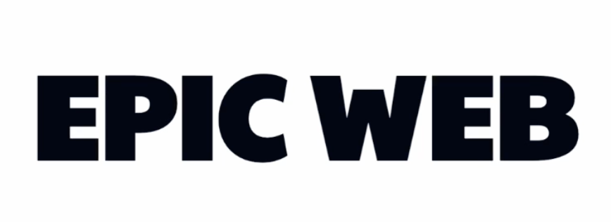
export default function ImageText() { return ( <div className="font-paytone-one grid h-screen place-items-center"> <h1 className="text-8xl font-black uppercase">Epic Web</h1> </div> );}
Our goal is to show an image through this text, and there are a few options to achieve that.
I'm going to start by using the bg-clip-text property. I thought a space landscape with many pinks and purples would look pretty cool, so I've asked ChatGPT to create one for me.

To apply the image as a background, we'll use bg-[url()] on our heading tag, and inside the url() value you pass the URL of the image. I've placed that image in my project, so I can reach it with images/space-scene.png.
export default function ImageText() { return ( <div className="font-paytone-one grid h-screen place-items-center"> <h1 className="text-8xl font-black uppercase bg-[url('/img/space-scene.png')]"> Epic Web</div> </h1> );}

Next, we'll use the bg-clip-text. It will look like the image has disappeared, but it has not. It's simply hidden behind the black color text that is applied to our h1. And we can reveal this by making the text of the h1 transparent.
export default function ImageText() { return ( <div className="font-paytone-one grid h-screen place-items-center"> <h1 className="bg-[url('/img/space-scene.png')] bg-clip-text text-8xl font-black uppercase text-transparent"> Epic Web</div> </h1> );}
And just like that, we have a pretty cool baseline effect of text showing an image. You can see the image is a little bit blurry, and this is because the image is much bigger than the text. To fix this, I'll add the bg-cover property, so it's going to crop the image better to fit within the text.
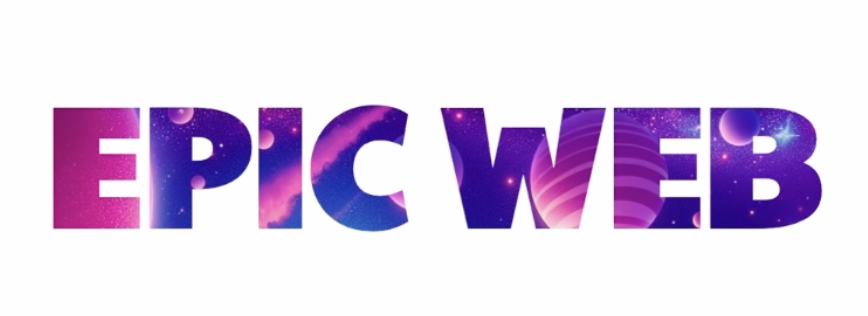
It's starting to look really good!
Adding Animation to the Background
Instead of using bg-cover, we'll intentionally make the size a bit bigger than necessary. We'll set it to bg-[130%].
But we want this to be the background size. If you hover over bg-[130%], you can see we have background-position, so we can drop a hint to the arbitrary value that this is a kind of length CSS data type; bg-[length:130%]. Now If you hover you'll see background-size
Quick tip: If you type "size" followed by an arbitrary value, it will also set it to background-size. This can make the code more readable, bg-[size:130%]
Now the image will be approximately 30% bigger than the word. The goal is to move the background image diagonally behind the text, creating an interesting visual effect.
Let's update the config file to extend the keyframes object. We'll name our animation "slowpan".
keyframes: { slowpan: { '0%': { backgroundPosition: 'top left' }, '100%': { backgroundPosition: 'bottom right' },}
Next, let's create a new animation and use the "slowpan" keyframe. For now, we'll make the animation duration very fast to help us better understand what's happening
animation: { slowpan: 'slowpan 5s linear infinite',}
Okay, so on our h1, we will add the new animate utility we've created animate-slowpan, which is using the keyframes we've just defined.
export default function ImageText() { return ( <div className="font-paytone-one grid h-screen place-items-center"> <div className="bg-[url('/img/space-scene.png')] bg-clip-text text-8xl font-black uppercase text-transparent animate-slowpan"> Epic Web</div> </div> );}
Once you play the animation you will notice that it animates from top to bottom and then jumps back to the starting position. To fix this, we change the animation direction to alternate. Also let's speed up the animation to 3 seconds to see the changes more quickly.
animation: { slowpan: 'slowpan 3s alternate linear infinite',}
The animation now moves down and back up smoothly. Let's slow it down and add some easing instead of linear bounce to make it look even better. We change the duration from 3 seconds to 30 seconds and try the default ease-in-out easing.
animation: { slowpan: 'slowpan 30s alternate ease-in-out infinite',}
We can see that the animation slows down as it reaches the top and starts again smoothly, creating a polished effect.
The bg-clip-text is somewhat limited. It only allows text to show the image through it, and we might want the image to also be visible outside of the text, albeit in a more subtle and faded way. Additionally, we might want to use shapes or border/ring utilities instead of text to achieve a similar effect.
To accomplish this, we can use mixed blend modes, which will be demonstrated in another tip.
Transcript
00:00 Let's have some fun with text and image clipping effects. This is our starting point, it's just a big black bold piece of text. You can see that I'm using this custom Paytone 1 font, just so that we have nice chunky letters to make the effect more fun. We want to show an image through this text, and there's a few options to achieve that.
00:18 And I'm going to start by using the background clip text property. And I thought that a space landscape with a lot of pinks and purples would look pretty cool, so I've asked ChatGPD to create one for me. And honestly, I think it nailed it. Okay, so I'll add a background image to my heading tag, and you can do this with an arbitrary
00:36 value where you pass the URL of the image. And I've placed that image in my project, so I can reach it with imagespace-scene.png. Okay, so it's looking pretty terrible for now, but just you wait. Instead of clipping that image around the text, I'm going to change the background clip
00:55 property, and here I'm going to choose background clip text. Uh-oh, looks like our image has disappeared, but it has not. It's simply hidden behind the black color text that is applied to our H1. And I can reveal this by making the text of the H1 transparent.
01:13 And just like that, we have a pretty cool baseline effect of text showing an image. You can see the image is a little bit blurry, and this is because the image is much bigger than the text. And so I'll add the bg-cover property, background-size-cover, so it's going to better crop the image to fit within the text. And look at this, this is starting to look really good.
01:33 We could definitely stop there, this is already a pretty cool effect, but let's take it to the next step by adding some animation of this background. Instead of background-size-cover, I will intentionally make the size a little bit bigger than necessary, and so I'll make it 130%. But we want this to be the background size.
01:50 If I hover, you can see we have background-position, so we can drop a hint to the arbitrary value that this is a kind of weird but length CSS data type. And now look at this, it's background-size, 130%. And quick tip that I don't think is documented, but I found that by accident.
02:07 If you go size here, the arbitrary value will also set it to background-size. And I think that's a little bit more readable. So now the image is sort of something like this in terms of size, 30% bigger than the word. And so we're going to create an animation that moves this image from the top left corner,
02:25 where it is now, to a position like this. So the background image is going to move sort of diagonally behind the text, and hopefully that should look really cool. Okay, let's drop into our config file and we're going to extend the keyframes object.
02:41 We'll call our animation slow pan, and so at the 0% keyframe, we're going to animate the background position to top left. And then at 100%, we're going to move it to bottom right. And let's create a new animation.
02:59 We can also call it slow pan, but you don't have to. And we're going to use this keyframe. We'll make it way too fast for now so we understand what's happening. So five seconds. And yeah, let's try linear and infinite for now. This is not going to look good, but it's going to help us understand what we need to tweak.
03:16 Okay, so on our H1, we will add the new animate utility we've created, which is using the keyframes we've just defined. So it's actually not too bad, but let's count one, two, three, four, five. And did you see that?
03:34 It animates from top to bottom and then jumps back to the starting position. So we need to change the animation direction to alternate. And let's even speed up our animation to three seconds. And let's take a look. So going down and going back up and going back down.
03:52 It's already pretty cool, but let's slow it right down and add some easing instead of linear bounce. And it's going to look super good. I'll change the duration from three seconds to 30 seconds. And instead of linear here, so let's try the default ease in out. So the animation is going to start very slow and progressively speed up.
04:12 I'm not going to make you wait 30 seconds again, so I will fast forward the video to the point where it changes direction. All right, we're getting there and you can see that it's moving faster, but now it's slowing down to the point of the middle of the animation and it's going to bounce back super slowly.
04:29 This is perfect. Ease in out turned out to be perfect. Let's just verify what happens on the other end of the loop when it hits the top and starts again. Okay, we're getting to the top, we're slowing right down and we're starting again, super smooth.
04:47 Hey, isn't that looking great? So this is a pretty cool effect in itself, but the background clip text is somewhat limited to just that, have text with image showing through it. Quite often this is what you want, but what if we wanted to go a step further in our effect
05:05 and have maybe the image also show outside of the text, but in a more subtle and faded out way. And what if we wanted something else than text show the image through, like something like a shape or like a border or ring utility. And we can achieve this with mixed blend modes. And I'll show you that in another tip.
- Play Congratulations on Completing the Workshop!
Congratulations on Completing the Workshop!
- Play App Varieties - Wrap Up
App Varieties - Wrap Up
- Play Simple Apps Without package.json - Solution
Simple Apps Without package.json - Solution
- Play Simple Apps Without package.json - Problem
Simple Apps Without package.json - Problem
- Play Apps Without Preview - Solution
Apps Without Preview - Solution
- Play Apps Without Preview - Problem
Apps Without Preview - Problem


