
Enhance Text Readability with a Gradient
Due to the intensity of the images, the small text on the cards isn't very readable:
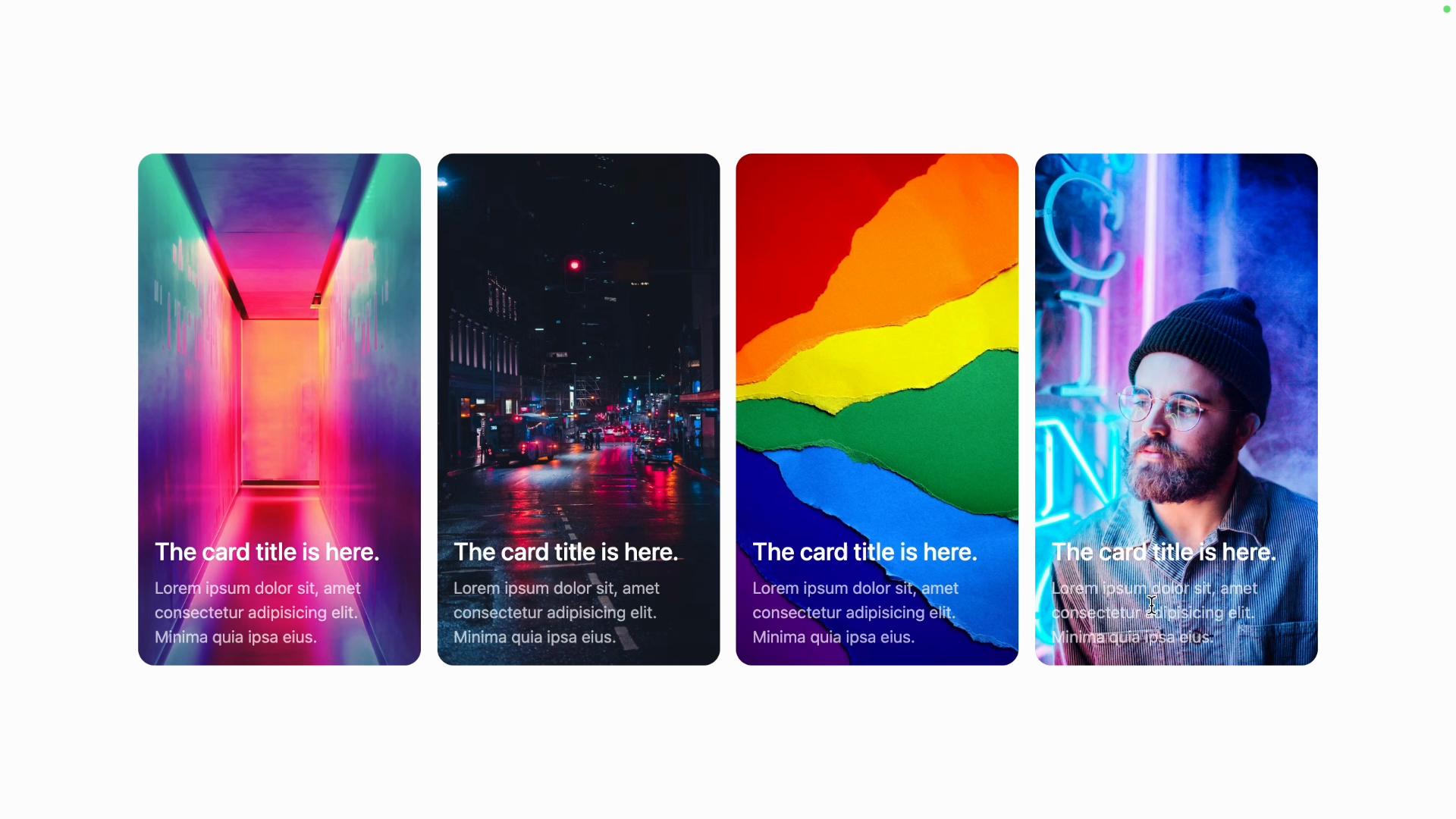
Adding a subtle background gradient behind the text is a common technique used to enha
Transcript
00:00 And so you can see the start of a problem here, because we have these vibrant images. The text is not always very readable because it's small and semi-transparent. What we can do is possibly add a subtle background behind it to improve the contrast a little bit.
00:18 And actually, I think, it's hard to tell, but I think that the DJI site does this. It's also working with less intense images. But so what we're going to do is add a little background gradient to make things a bit more pleasant.
00:33 So we want a gradient that is sort of transparent black at the bottom and is increasingly more transparent as it reaches the top. So it's pretty subtle and it fades out from here to transparent up here. So on our div that contains the H2 and the paragraph, I will add a background gradient
00:53 to and let's go to top and we'll go from black. And if we don't specify the two, it'll be transparent. So that should work. Let's take a look. And yeah, it's hard to tell, but it's actually easier to read now because there is this black background overlay over the image.
01:11 I'll make a slightly bigger portion of the gradient be black. And so what I'll do is I'll change the "fromPosition" instead of 0% with the "from30%" utility, which will set the gradient from position CSS variable.
01:29 So now it's going to be completely black up to 30% of this gradient and then start to fade. Just to make it clear, if this was from 90%, you can see that now it's black 90% of the way and only fades to transparent the last 10%.
01:44 So let's go back to 30% and instead of pure black, we will go black at 70% opacity. And yeah, I think that's looking really cool. This is pretty subtle and you're not necessarily going to notice if you don't know the photos, but it does make the text more readable.