Building Accessible Web Apps

Shruti shares her journey into working on accessibility full-time, and how it completely changed the way she thinks about building for the web.
One of her main points is that accessibility isn’t just about ticking off checkboxes or getting a high Lighthouse score. It’s about making things work for real people—people who use screen readers, rely on keyboards, or deal with cognitive or temporary disabilities. And the only way to do that well is to think about accessibility from the start—not bolt it on at the end.
She shares an example of a zigzag ramp that technically meets accessibility standards but clearly wasn’t built with real people in mind. It’s a perfect example of what happens when accessibility is treated as an afterthought. Instead, she makes the case that accessibility should be part of the process from the start—like mixing blueberries into muffin batter, not tossing them on top after it’s already baked.
She also gives super practical advice—like designing with enough contrast, thinking about zoom and readability, and keeping content short and clear. Her biggest message? Accessibility helps everyone. It's not a nice-to-have or something only big companies should care about—it’s just good design.
Share this talk
Transcript
Stand up. Good. Good. Hands up. Here. Hands up.
Hands up.
Yay. Thank you. Okay. I can't see anything.
I need water.
You know what? We literally recreated history because on this stage, in the last remix con, we danced to the same singers, Diljit Dusan's music, and we created a record, and the artist retweeted us. That has never happened for a tech conference. Okay. Actually, let's get back into tech. Right. Play. Alright.
So we're gonna talk about building accessible web, and, the reason I'm doing this talk at a front end conference almost towards the end of the day is because I am sure you all feel like we're all front end experts. Right? We've been working in the industry for ten years, eleven years, twelve years, three years.
We can build apps. We can make it accessible, or we can kind of figure it out by reading out the documentation on WCAG, and we can do the checklist, and we got a lighthouse score, and it's good. I thought the same. I was so wrong.
I thought I was a funnel expert until I actually became an accessibility engineer, and, oh my god, the amount of work it takes to make a web app accessible is so much more than what I thought.
It takes so much thought process to make sure that your app is not just code wise accessible, but actually user experience wise accessible as well. What does that mean? I feel like when I explain what accessibility is like and why you should care about accessibility, I give an example of baking a blueberry muffin.
So how do you bake a blueberry muffin? If you wanna bake a blueberry muffin, do you take a muffin and shove blueberries in it in the last moment, or do you kind of put blueberries in the batter? You put it in the batter from the beginning. Accessibility is the same way. If you build a web app
did I advance myself?
Oh my god. Wait.
There we go. Back to muffins. So if you build a web app and you're almost done and towards the end, your legal team tells you you have to make it accessible. It's kind of like putting blueberries in a baked muffin.
It is a lot of code work and it looks pretty shitty, and we sometimes end up with an expectation of building a ramp, for example, you know, building an accessible web app. And because we're doing it at the last moment, we have to make sure the code is accessible and it follows the checklist and guidelines.
We end up with this. It has a ramp, it has the bar, but is it accessible? No. There's, like, stairs between the ramps. Who the hell can use that? First of all, it's blocked.
And that's kind of what shoving accessibility in the end feels like in a web app to a user who's reliant on that, on assistive technologies to use your app.
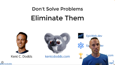
So through this app, I'm gonna show you through this talk, I'm gonna show you how to think about accessibility from the get go itself so we make a really nice and delicious blueberry muffin. Before I get started, my name is Shruti Kapoor.
I am a developer, content creator, staff engineer, O'Reilly instructor, and I also have a YouTube channel. If you like me here, you might like me better over there because I'm totally unhinged there.
And you know what? I'm also part of the epic web universe.
I'm an epic web avenger, and I tell people to be accessible. There are some resources that I have on the epic web, which I'm gonna point to in this talk, but basically, there are two detailed articles that I've written down on testing accessibility with screen readers and testing accessibility with keyboard.
This talk is short, so those are great accompaniment to this talks. But here's what we're gonna talk about. We're gonna talk about the who, when, and what. Why should I care about accessibility and who should care about accessibility?
How to build a web access web, web app that is accessible and when to build it, when to think about it, and what do I need to do? So first question I feel like a lot of people have in their minds is, well, I have a small company. I have limited number of users.
Do I really care about building an accessible app? First of all, if you don't build an accessible app, you could get a legal lawsuit. So yes, you should care about building an accessible web app, but also, oftentimes, we don't always think about the disabilities that a user might be encountering.
We are not always aware of a disability people have. Here's an example. So here's a picture of various people experiencing different forms of disability. Something to note is that disability is not always permanent. It can be temporary as well.
For example, you could have been in an accident and you have a cast on your arm, and so you can only use one arm. For example, right now, I'm using only one arm to talk to you guys.
You could also people could also be experiencing motor disabilities and could also be using hearing aids to listen to what the site has to say using a screen reader. So people rely on assistive technologies to use the web today.
And if you think, like, you have a small audience and it doesn't really matter because, you know, it's an internal tool and you don't really have people who have the needs. Think again. The numbers are crazy. Look at these numbers. One in four people in The US have some form of disability.
You know what? When we think about disability, we don't always we usually think of, like, auditory disability when people can't hear or visual disability when people have trouble seeing something or maybe completely blind.
But also, look at these numbers, four point nine percent of people have vision disability, five point seven have difficulty hearing, and ten point eight percent have cognitive disability. What does cognitive disability mean? It's not a disability that's a pattern, not something that you can see. Cognitive disability could include neurodivergence, ADHD,
dyslexia, and learning disabilities. And these kind of disabilities are not often recognized and diagnosed, so we think more people are suffering from cognitive disabilities than the numbers say. And actually the graph is pretty clear to show that as well. This is just it's it's, this is just a graph.
On the second bar, if you see, it is a graph of people who are using the Internet today in The US, well, in 02/2008.
And if you look at the number of people who are deaf and hard of hearing in the yellow, and number of people who are blind and low vision, this doesn't include people with cognitive disability yet, but even just those two numbers is almost one fourth of the graph of people who use Internet.
So if you don't implicitly include people,
you're implicitly excluding them. If you don't explicitly include people, you're implicitly excluding people. Not only are you gonna be losing money, but you could also get a legal lawsuit. And I think accessibility is not good just for people who are experiencing disability.
You are going up a flight of stairs and you need a ramp, you are trying to open a door when you have your hands full, you need a button to open the door, or in the night mode when you were trying to watch YouTube and you need a dark mode.
So accessibility is for everyone and not just for people who are experiencing disabilities.
So let's make it accessible. What does web accessibility mean, and what does it mean for people what does it mean for a web app to be accessible?
Web accessibility is well defined in this definition, which says a person with a disability your web your web app is accessible when a person with a disability can acquire the same information, engage in the same experience, and enjoy the same services as a person without disability. What's important here is the phrase substantially equal and ease of use.
What does that mean? Don't just build a shitty interface for people who need who have disabilities. The experience needs to be good enough so that people can experience your website in the same good UX manner that people without disabilities can't.
And that is the point that I'm gonna show you in the demo as well, which is if you just think about code correctness and adding checklist and adding just code that is technically correct, the experience can still be bad.
Okay. So people use the web in different ways. We use screen readers, screen magnifiers, selection switches, head tracker for mouse, and closed captions. I go into this in detail in my article, so I'm going to skip past this.
And in order to be accessible, I think the first question we have to think about is when is the right time to be accessible? Should it be in the beginning of the development phase? Should it be in the design phase? Should it be when I'm almost about to be done? And the answer is right now.
Go check out your apps right now and see if you can experience the apps with just a screen reader and a keyboard. I'm sure most of you probably don't know how to do that, so I'll be demoing that. Don't worry, I got you.
One of the best ways to also experience accessibility and make accessibility right into your app is in the design phase. Now there's a bunch of things that you have to think about when building accessible web apps: color contrast, keyboard and focusable elements, responsive text, which is when people can zoom in.
I have noticed that people zoom into websites almost at 400%, which is that if you have something here and you've got something over there, somebody zoomed in so much into this side, how are they going to navigate from this side to this side?
That is a user experience you have to think about, and that is well incorporated into the design phase, and your apps are much better have a much better UX if you incorporate that within the design phase itself. Also clear and concise content, and that is extremely important for people with learning disabilities and cognitive disabilities.
People with learning disabilities are not able to read a huge text, so remember to have content that can display information in as concise manner as possible. And the best way to do is to have a design system that has accessible components baked into it. Alright. So let's talk about development.
I have nine minutes, so I'm gonna skip past this and take you right into the code.
But before I get into code, here are eight things that you need to consider for having, for thinking about accessibility during the development phase. I'm gonna pause here for one second in case you wanna take screenshots, and then I'll get right into code.
Okay. Before I get into code, remember, you could have an accessible component, but your app may still not be accessible. What the heck? Why?
Because you need to make sure that when you put components together, they also work well with each other, that your focus lands in the right place, that users always have an idea of where they are in the app.
So let's just do things.
Okay. I'm going to switch into demo mode.
Eight minutes to go.
Okay. So here's an app that I want to show you. This app looks pretty clean. It is made on TanStack Start. Anybody using TanStack Start? Yeah. Yeah. Maybe one or two people, which is okay because I'm gonna make a tutorial on TanStack Start on my YouTube. Yay.
Shameless plug. Okay. Anyways, this app looks pretty clean. Right? What is this app doing? You know that I love dev jokes, so this app actually is a dev joke app. And this is my favorite dev joke. Let's say,
what are pointers in C like? I know a guy who knows a guy who knows another guy. So, you know, as somebody who is able to read and view and has motor disabilities, I'm able to navigate the site by just like scrolling. You know, no big deal.
But what does a person experiencing motor disabilities or visual disabilities experience this site like? Let's take a look. For doing this, I'm gonna turn on my VoiceOver, and I'm gonna mute my computer. So by the way, you can access voice over by going to accessibility shortcuts and voice over in your computer.
And all computers come with a voice over, even if you're on Windows, which you shouldn't be. Okay. So we're on the top,
field, and I'm going to turn on the keyboard as well just so you know that I'm not cheating. Okay. Here's the keyboard. All right? So as I type something, the keyboard kind of highlights what I'm which key is I'm pushing in. Alright. So I am in the input field. My focus is there. All good.
Now if I hit tab, which people which is what people would typically do, I go to the next input field. Perfect. No problem so far. Now if I hit tab and I want to read the next joke, wait, why am I taken to the top? Wait, what? I can't even get to the first joke at all.
That is such a broken experience. And this is what a person experiencing this site with a screen reader would see if I did not do any UX in this site to think about accessibility at all. Let's fix this site. So what you just saw was screen reader testing and keyboard testing.
Where is my code?
Okay. So we saw testing with screen reader and keyboard. Now why is this not accessible? What's the problem? It looks pretty fine. So if you realize, I'm actually using chassis and components, but chassis and components are typically accessible themselves. So what is the problem? Let's inspect this.
I'm going to move these people aside as well and make my keywords small. Okay. So if you look at this div, and we all actually in Google Chrome, we have this at the bottom, it says enable full page accessibility tree, so we'll see a man at the top.
If I click on this, you'll see what the screen reader sees. This is exactly what the accessibility tree is like, so this is what the screen reader sees. Now if you look over this, this is actually the joke that I'm pointing at, it says ignored. What does that mean?
It means that the screen reader will never see this. And why is that? Let's take a look at the code. Turn this off. And in the code you see is it big enough, hopefully? In the back? Okay, sweet. In the code here you see there's a data slot, but I don't see any ARIA attributes.
I don't see any roles. And that is the problem. A div is not a semantic element, so a screen reader has no idea what this is. For a screen reader, this code might as well be presentational content. So some screen readers may look into it, but some screen readers might skip it.
Therefore, it is important that you use a semantic element to display information. Now what does this text kind of look like? What element do you think would be a good element here? Section. That is a good one. So we can section this out. We can section these out.
Anything else for display? Say that again. Article. Article is a good one. Yeah. P tag. Say that again. P for text. P for text. Yeah. Actually, I'm also using p in here, but because I am not showing any role at the top, screen reader will ignore it.
And that is kind of a nuance, like you would think that your child component is accessible, so your app should be accessible. But because you're not picking up roles at the top, it could be inaccessible. Alright. So let's get into step number two.
By the way, all of this code is online, so don't worry about getting it. I will share that in just a second.
Step two.
Okay. All right, so if I reload. All right.
Now let's see. I'm at the top of this list, and screen reader says enter your joke setup. So by the way, this text that you see here is exactly what screen reader is announcing. So now I'm in here. I'm gonna hit tap key, and then if I hit tap key again okay. I'm at the element now. Nice.
What did I do? I'll show you. Actually, let's do let's see if I can go to the bottom of this list. So if I keep hitting tab key, I do go to the bottom of the list, so it's technically navigable. Awesome. People can interact with my site. Thank God. They can read my jokes. Thank you.
But let's see here. All the way at the bottom, I have a subscription email. I have a subscription thing. If I had 50 jokes, people would have to, like, tab through each of them, maybe they'll get bored by the jokes that I've written, and maybe they'll just navigate away. How I'm losing people here.
How can I make people go to the subscription if they're not interested in reading any jokes?
Let's look at the step three for that.
Git checkout. Ally. Final step. Okay.
Say what? I know. Cursor ain't got nothing on me. Okay. Let's reload this. Okay. So I'm at the top of the list again, and watch the keys that I use here. Hopefully that's big enough. So I hit tab again, then I hit tab. I'm gonna close this because there's too much stuff going on. Okay. Hit tab, tab.
Okay. I'm at the top of the list, but now if I go use my arrow keys, people can navigate in the list. But if I hit tab again, they go to the subscription. How did that happen? Magic. Accessibility. Now you see how much better of a user experience this is. Right?
Like, if people don't want to read the list, they don't have to. Like, they'll go here, hit tab tab, they'll see the first joke, they're like, oh my gosh, she's back at it again, and they just hit tab again. So now they're at the subscription and they can be like, okay, fine.
Just send it to me in email, email. I don't want to listen to it right now. Much better experience than people forcing people to go through a huge list. This is possible through something called a roving tab index.
And in the thirty five seconds that I have remaining, I'm gonna show you what roving tab index means by showing you the recipe, and then I will show you what actually it looks like in the code. So let me actually open the code, move this out of the way, move this out of the way.
Inspect. Okay.
Let's go to this guy, this guy, and I'm going to be here.
All right. So this is what the code diff is. First of all, I added a role of list. This is the same as having a semantic list element. The reason I'm using list is because I'm using card component from ShadCien, and I want to keep preserve the UI of it. I want to preserve the card field.
Then for each of these jokes, I have a role of list item. So I did two things. I added a role of list to the top parent element, then I added a role of list item to the child. I also added tab index equals zero. Now watch the tab index here as I navigate this list.
So I navigate here, I'm right here. So tab index is zero. Now if I go down, you see the tab index of the next element is zero. Are you all able to see that? And it updates to the next element to the next element. And then the previous element gets a tab index of minus one.
That is roving tab index. And let me show you a recipe of how to do that, and then we will call it a day.
Okay. So here's how to make roving tab index. First of all, make the joke list a single tab stop by adding tab index equals zero on the first element. That is the first joke on the top. Then as you're navigating, make sure that every other joke has a tab index of minus one.
Track the active element using a property like active index. This keeps track of which element has focus, and if you move back to the list, that focus will still remain. Listen for key down events and when focus is outside the list, use tab to navigate back to the list.
Then if the list loses focus, remove tab index from all elements in the list, and this is just to make sure that none of the items get focused back again. And if the list gains focus, add tab index back to the previously focused element.
I know this makes no sense to you right now, so I'm gonna leave you with the code and the GitHub repo so you can check it out at your own time.
That is the code, and that is all I have for you.